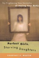
Here are two other covers of the same books (Levenslang is the Dutch translation of Life Sentences):
I actually think I prefer these two covers: I like the fact that the book title on Lippman’s book is not obscuring the girl’s body, and the slanted image on Martin’s book makes it more eye-catching.
Martin’s book was published first, by Free Press in 2007, while Lippman’s book came out with William Morrow in 2009. In this case, however, it seems to me that it’s less of a big deal that the cover image was reused, since the books are in such different genres and the covers are also really different. What do you think?
Martin’s book was published first, by Free Press in 2007, while Lippman’s book came out with William Morrow in 2009. In this case, however, it seems to me that it’s less of a big deal that the cover image was reused, since the books are in such different genres and the covers are also really different. What do you think?


I like the bottom two better, too. Maybe in part because I hate it when the author's name is printed larger than the book's title, as with Life Sentences. The tilted image and the slightly brighter colors definitely make Martin's book jump out at you more.
ReplyDeleteWith the different treatments, reusing this photo seems fine. It's not so obvious that they're the same.
ReplyDeleteI think reusing the photos work since they managed to make them look different. If you don't have the books side by side you probably wouldn't realize it is the same photo.
ReplyDeleteAvis, what really surprises me is that there are so many covers that use almost identical images. You would think that would be an infringement of copyright law or something like that, but obviously it's allowed.
ReplyDeleteI agree, the bottom two are much better. I really don't like how they've done the title in the English version of Life Sentences.
ReplyDeleteLike Kathy said, I like that they didn't used the photo the same way. My favorite is Life Sentences. Love the color!
ReplyDeleteI love coming here to see what new similar covers you've found. I can't believe how often it happens.
ReplyDeleteI like the one on the lower left the best. The colors and the clarity of the image.
ReplyDeleteThat's sound so exciting.
ReplyDeleteI agree with you, I like the bottom two images better. The Dutch version of Life Sentences is my favorite.
ReplyDelete